Mobile and Wearable Design
For that project, I was the lead UX designer managing the creation of an entire brand new UI for a product that not only aligned with the different regulations across global markets but also focuses on the end user experience.
Edge track was built to the ground up to be a mobile/wearable solution to solve serialization supply chain challenges and addresses all the needs of serialization.

The Edge Track Product
Tracelink’s Edge Track application provides seamless integration of serialization and fulfillment operations in the warehouse. With a single scan, warehouse operators verify the inventory data expected by their Warehouse Management System (WMS), as well as the serialization data expected by Tracelink’s Serialized Operations Management application. By meeting business and compliance requirements in a single scan, Edge Track improves efficiencies in a warehouse.
The Challenges
Think small, really small screens first!
The IoT stretches the multi-device notion into a new world of connected things, expanding our family of devices to include a diversified range of gadgets, appliances, and accessories of any shape, size, or form factor. The real state provided to user interfaces in wearable tech devices is hardly noticeable so the approach designers typically took for PC, laptops and mobile phones will no longer be valid.
Consistency through devices!
Functionality will be distributed across multiple devices with different capabilities. Despite the number of devices and type, users need to feel as if they are using a coherent experience rather than a bunch of disjointed UIs. It’s important to consider not just the usability of individual UIs but inter-usability which is distributed user experience across multiple devices.
Research
Over the years we’ve been collecting feedback from customers regarding how they’d like to be able to use the application and what are their pain points. We sorted through customer feedback to figure out the requirements for the new Edge Track UI. There were a lot of different feature requests and it would take forever to get them all built, so we listed out the main features, prioritized them and concentrated on the ones that would make the most impact and help users to improve efficiencies in warehouses and be easy to use through multiple devices.
During this requirements-gathering phase we also looked at competitor products and realized that our differentiator would be to concentrate on simplicity of use, cutting back on unnecessary features and complexity.
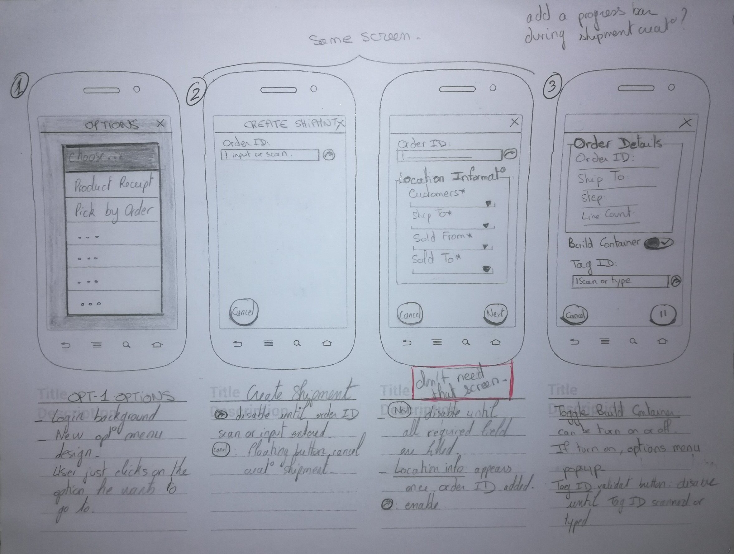

Wireframes& Sketches
Once we had planned out what we were going to build, the development team was able to start rebuilding the back-end for speed and stability. I started on the interface design in parallel with them to save time, and quickly sketched out some ideas (see above) on how this application would function. My focus was on creating maximal power with minimal UI.
After exploring a bunch of ideas and testing different userflows, I ended up sticking with the simplest userflow possible.

Wrist Device
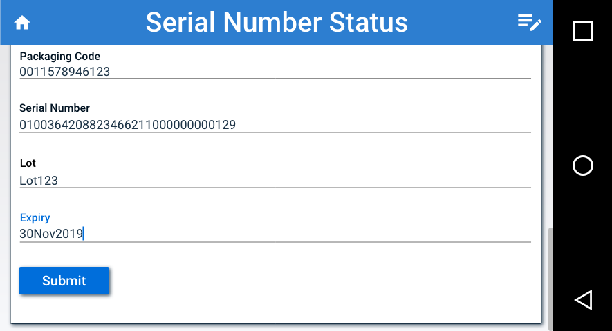

The Visuals
The visuals were pretty simple and fun to create as most of the hard work had been done to create the wireframes. I designed all the elements to create the UI.
Bright blue call-to-actions (see above) were used to help them stand out on the screen, and select boxes were styled using the same pattern. Once the front-end styles were applied, we tested out the feature on some staff that weren’t part of the project to pick up any major usability issues.

A Great Result
Since the launch of the app a few months ago, we’ve had lots of positive feedback. It’s always nice to see real users enjoying a product that you’ve worked on, but the journey doesn’t end here. We’ll continue to listen and learn, because as most product designers know, a good product is never finished.