Campaign Template
I was asked by Marketers to create a new interactive experience industry focused with the goal to generate awareness and drive revenue through lead generation.
This template needs to be easy to replicate, the content needs to be localizable and we should be able to drive traffic to one video and to gate some of the videos.
The Challenges
One of the challenges was the timeline. We were working on a really really aggressive timeline for that project. So to meet the deadline the stakeholders decided to hire a third party to realize the graphic design.
That where the second challenge appeared. We went from what should have been an easy project to a nightmare. To explain why it was a challenge to work with a third party you need to understand my initial role in this project.
My Role
My initial task was to be in charge of the User Experience through the entire project and to meet the product owners requirements. To do so I was the one creating the wireframe and once hand off to the agency I was supervising and making sure that my design was followed and that the User Experience was respected.
Sketching Wireframes
After figuring out the information architecture and meeting the stakeholders requirements, it was now time to sketch out some wireframe ideas (above) . The main focus was to have users navigate easily between each step of the Urb-e story and to have the entire content fitting above the fold of the screen.
The main interaction was the timeline at the bottom of the wireframe. Either users could scroll with their mouse and move forward on the timeline going through each step or they could click on one step and jump right away in the content of that step.
You need also to keep in mind that users could be sent directly on the welcome page or directly on a specific step in the story. In the last use case they need to find the information necessary to understand where they are in the story and what the project is about.
Switching Gears
From there, the agency’s role was to take care of the graphic design and to make the arrangements using my wireframe as an inspiration to create the final mockup. But after 3 weeks of back and forth between the agency and my team, it was clear that we were going now where because the 3rd party couldn’t understand what was our vision. So after discussion with stakeholders and the entire front-end team (myself included), we took the decision to let them go and that I was taking control back on the UI part.
Vertical scroll approach
Pushing Pixels
Because I saw that situation happening, I was prepared and came up with 2 versions in less than 48 hours.
One of the mockup was inspired by the wireframe adding just a few changes to make the user experience even better and the other one was living in my head from the start of the project so I decided to give it a shot and present that to the stakeholders as well.
Vertical Scroll (above)
Pros
Visually appealing
Easy to navigate
Full screen video player (content disappears on play)
Cons
Need to have very good video quality
Not easy to implement in the timeframe given
Not Mobile friendly
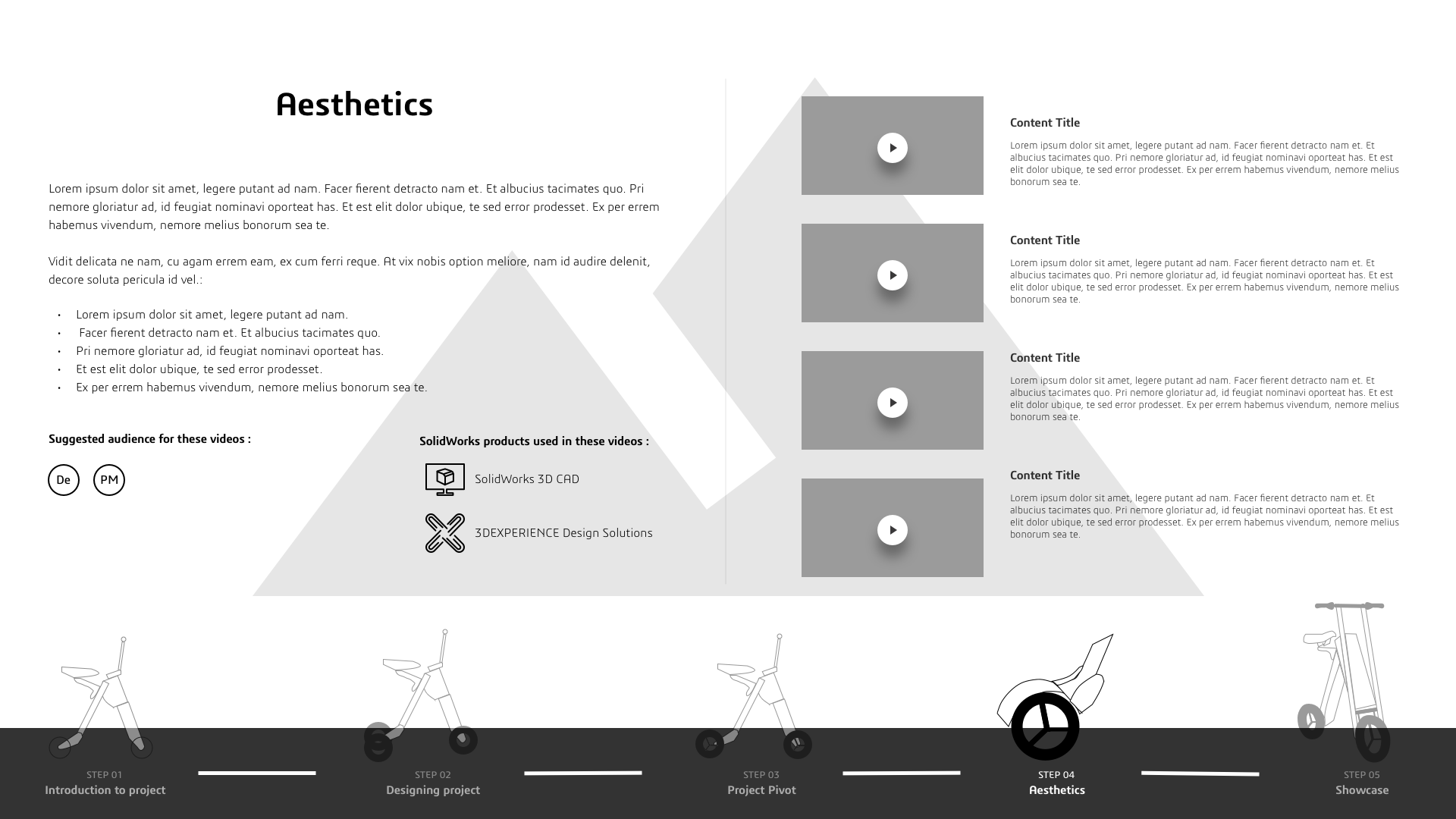
Horizontal Scroll (below)
Pros
Simple but efficient design
Mobile friendly
Easily reusable for other campaigns
Cons
Videos drawer not easy to handle on mobile
Videos drawer not easy to implement
Limited space for text
Horizontal scroll approach
A Reusable Template
As you may have guessed the “horizontal” scrolling won. Even if stakeholders liked the other approach they preferred to move forward with the simplest one and most importantly with the one that will be easiest to reuse for other campaigns in the future.
Urb-e campaign template has been implemented and you can take a look here.
It was a challenging for the reasons I explained before but it was a fun project.

