Mobile App Design
I was tasked to design an iOS app that is a mix of running app and charity app. The app needed to feel native to iOS while also encompassing a unique gaming aesthetic.


The Challenge
"Move 4 It" is a mobile application combining a fitness, charity and gaming aspect. The challenge here was to combine those 3 elements all together in keeping the navigation for the user easy and smooth.
Ideation
Based on customer feedback and analytics above , it was clear that only having the basic features would be the way to go about solving this challenge. After some research, we decided to keep simple the fitness and charity features' side and to concentrate our efforts on the gaming aspect.
After numerous sketches and brainstorming sessions, we concluded that the “must haves” for the app were a selection of charities and a clean fitness activity screen. We wanted to keep things very simple and focused on account activity as seen in the relatively simple sitemap above.
Sketching Wireframes
After checking out the competitors and figuring out the information architecture, it was now time to sketch out some wireframe ideas (above) . The fitness and charity funnel needed to be quick and easy so we tried to keep the process as short as possible. The biggest challenge was the main fitness screen with the gaming aspect, as we wanted to design something fun and very different to most fitness app.
Pushing pixels
Once we were happy with the wireframes, it was time to start on the visual design. This is one of my favorite parts of the design process as you can finally see things come together. I already had a pretty good idea of the aesthetic I wanted to achieve from working on the gaming part earlier on. It needed to be bright, fun, closed to the nature. I liked the idea of discovering famous natural places all over the world so I decided to go for a "trail" design. The user could choose the continent, then the place of the continent where they would like to run, bike or walk. The app would put them on the trail, in the real life environment they chose.
I put together the above UI style guide containing the main elements I needed for the design. The color palette consisted mainly of a soft teal shades and a bright heart red.
Designing the brand
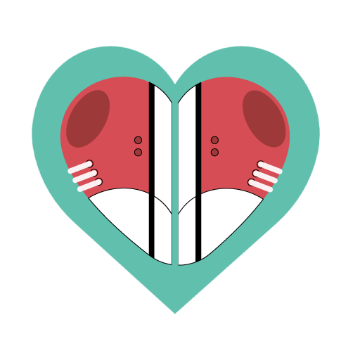
After talking to the client, I decided that the brand needed to have a realistic, nature aesthetic. We wanted to create a symbol that represented the spirit of both side of the app and its ideals of peace, health and community.
We threw some ideas around and started looking to the nature, particularly beaches, mountains, trails, for inspiration. We decided that the spirit of peace/community should be represented by the heart and health by a sneaker.
I sketched out a bunch of ideas (above left) for the logo symbol, concentrating on the shape of the heart. I wanted to take a more abstract approach and focus on representing the heart in different ways. I started using letters to draw heart in various shapes and sizes, but soon realized that it would not be easy to have . I kept the logo design very minimal and paired the symbol with clean typography as seen above.
A Great Result
The launch of the app should be in a few months. It’s always great to imagine real users enjoying a product that you’ve worked on, but the journey doesn’t end here. We’ll continue to listen and learn, because as most product designers know, a good product is never finished.